
Today's assignment. Make logo with a 130 degree drop shadow. Sounds easy with just a click of a mouse right? Illustrator failure. Notice the drop doesn't remain even among all letters. Almost as if the light source is shifted between letters.
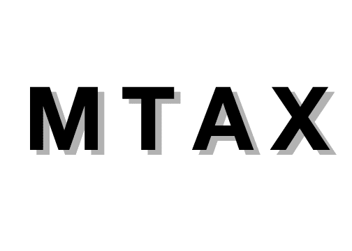 Option II, hand kern and stretch the letters. The shadows for the X may be distorted but looks much better optically.
